UX Case Study · iOS · 2025
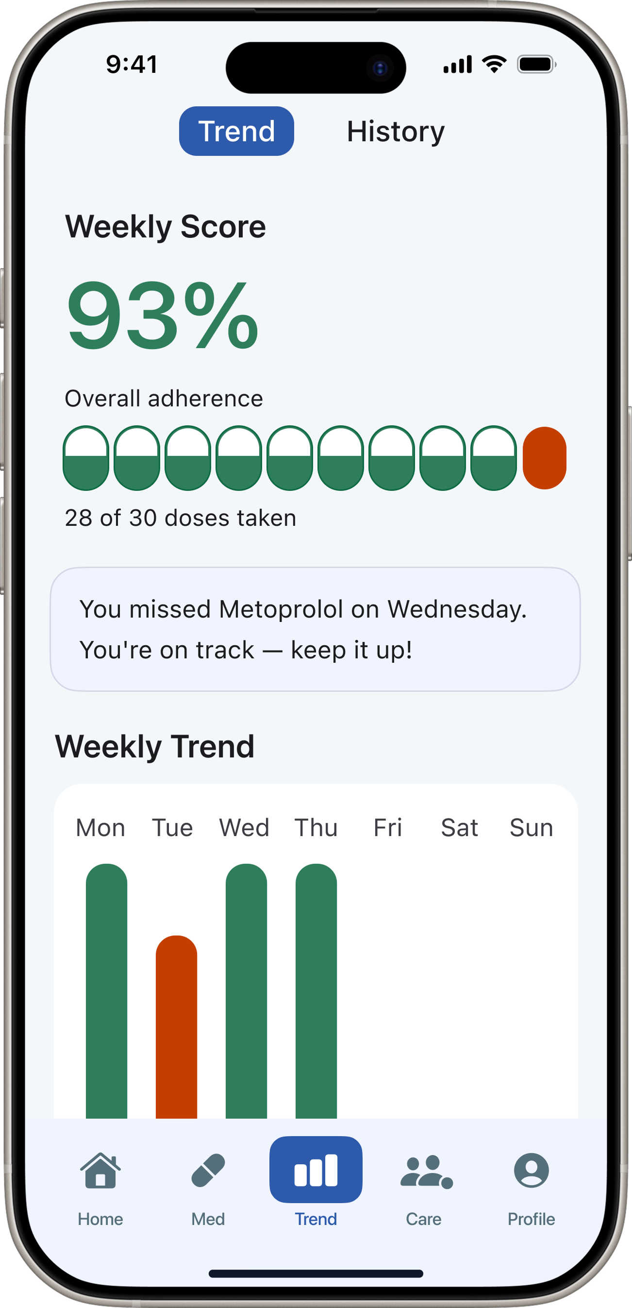
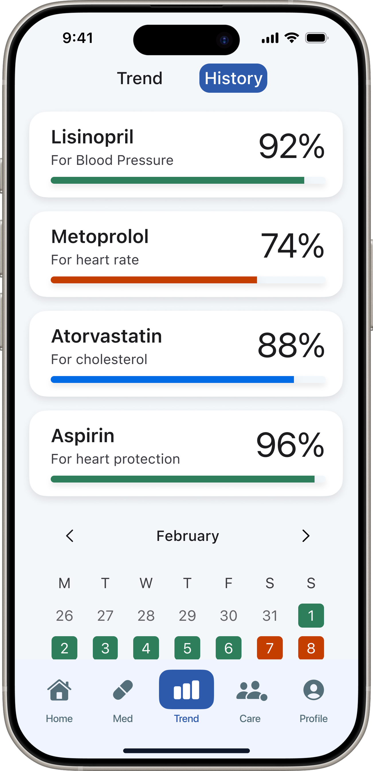
Medication
adherence
for adults 65+
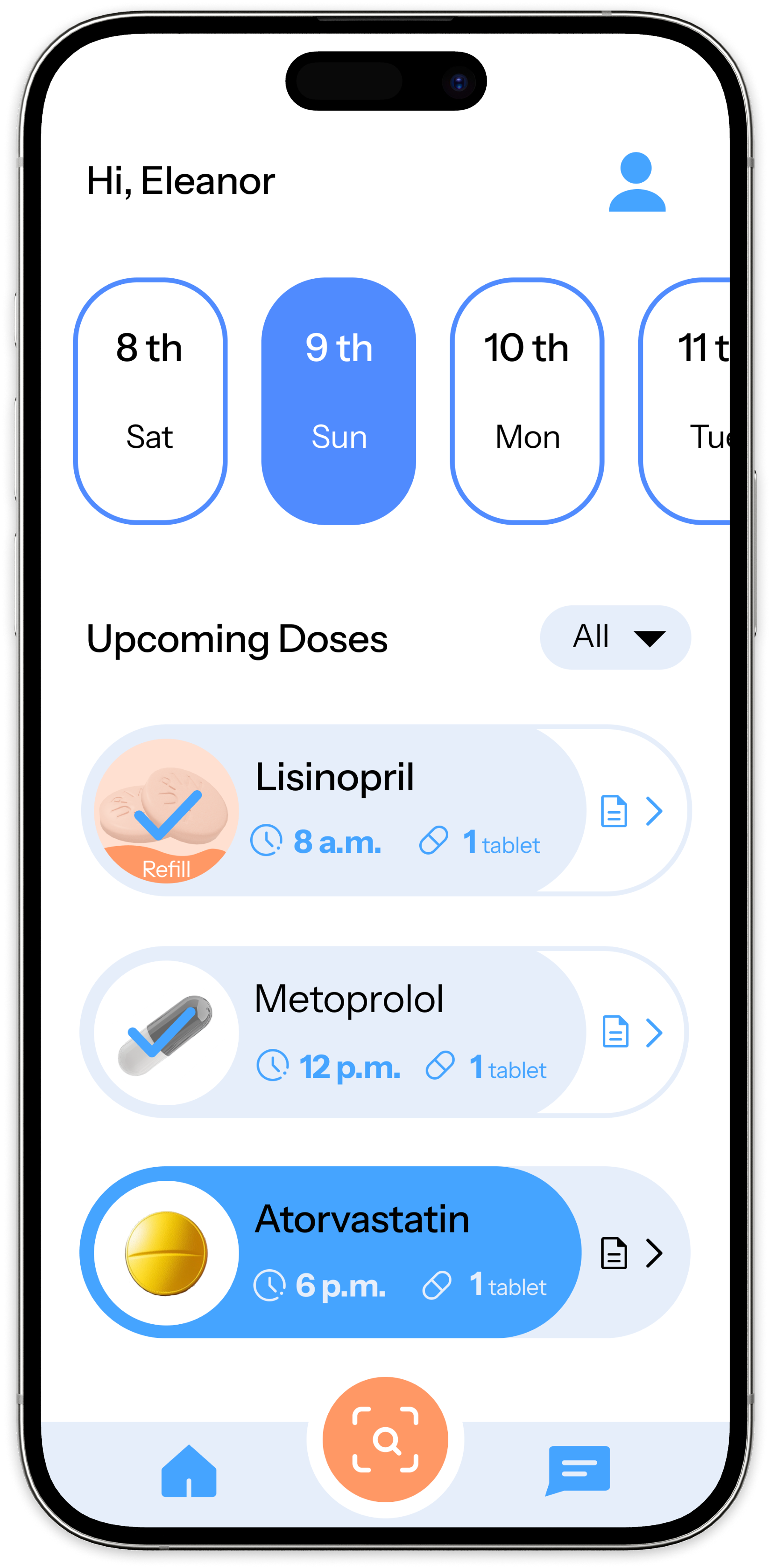
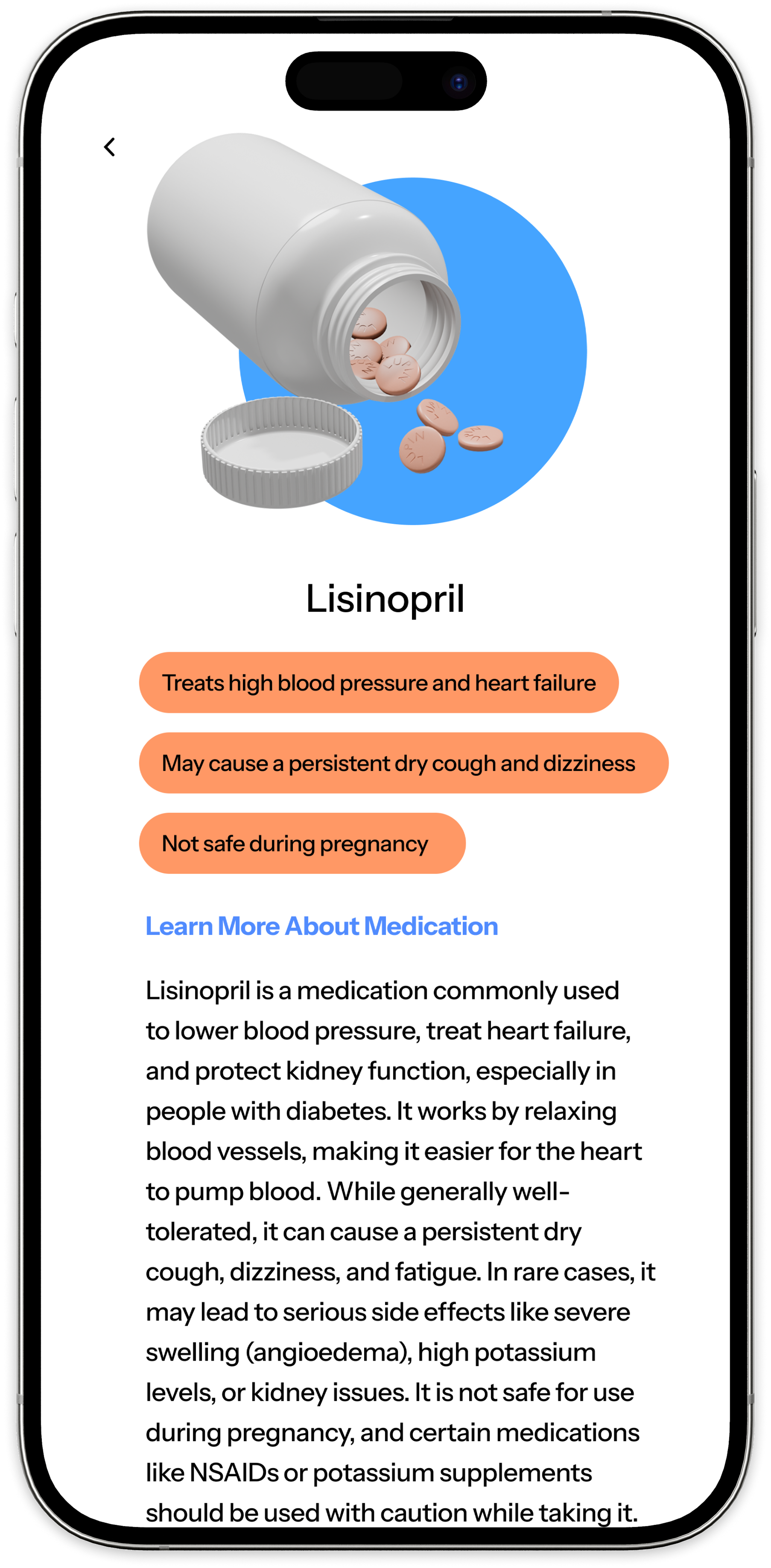
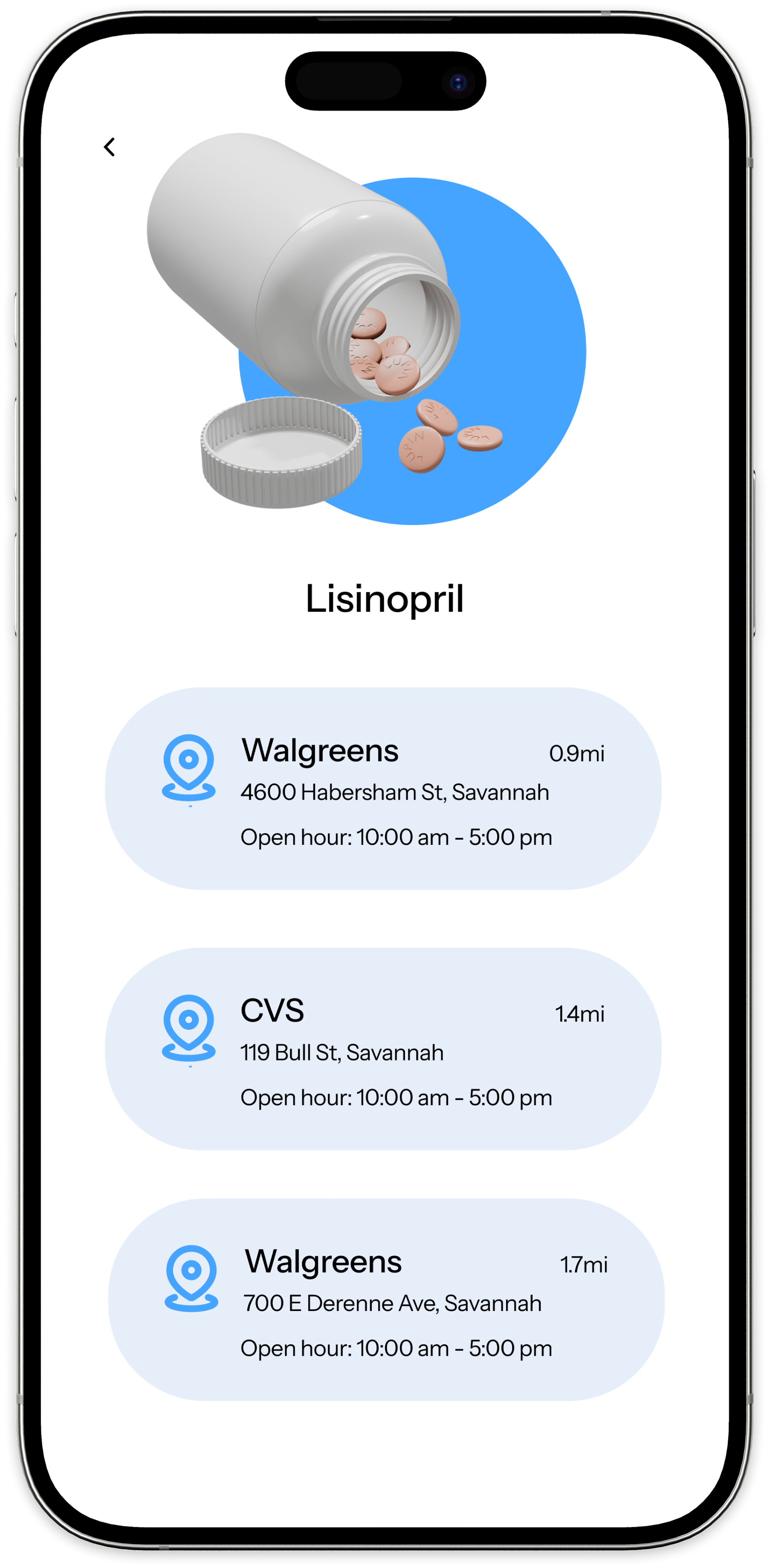
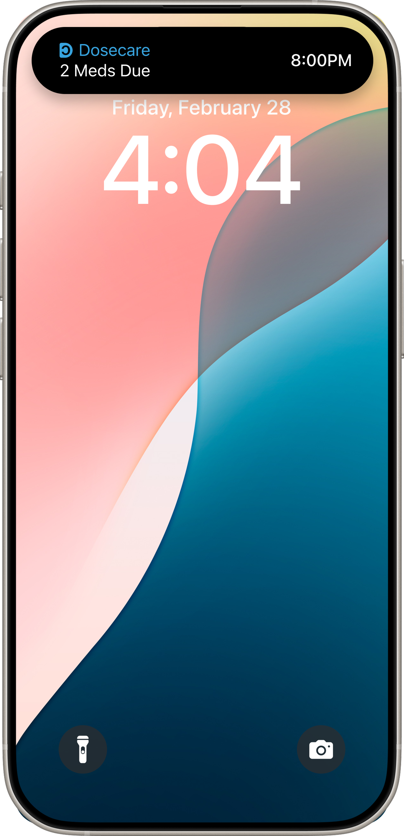
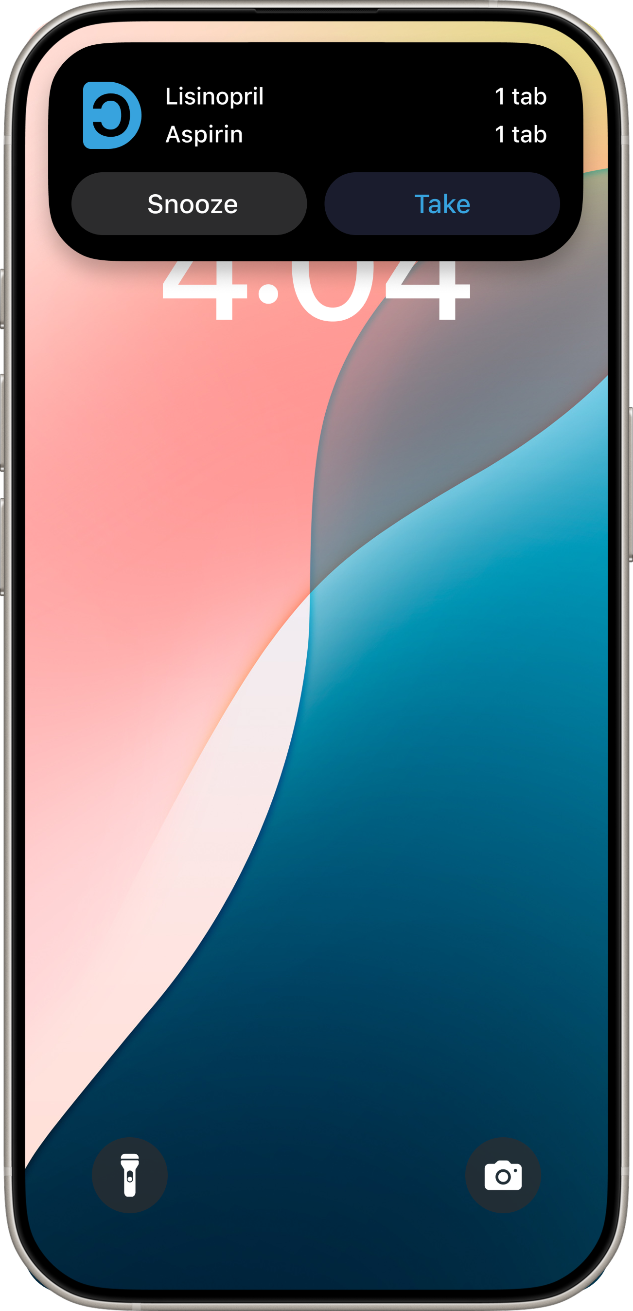
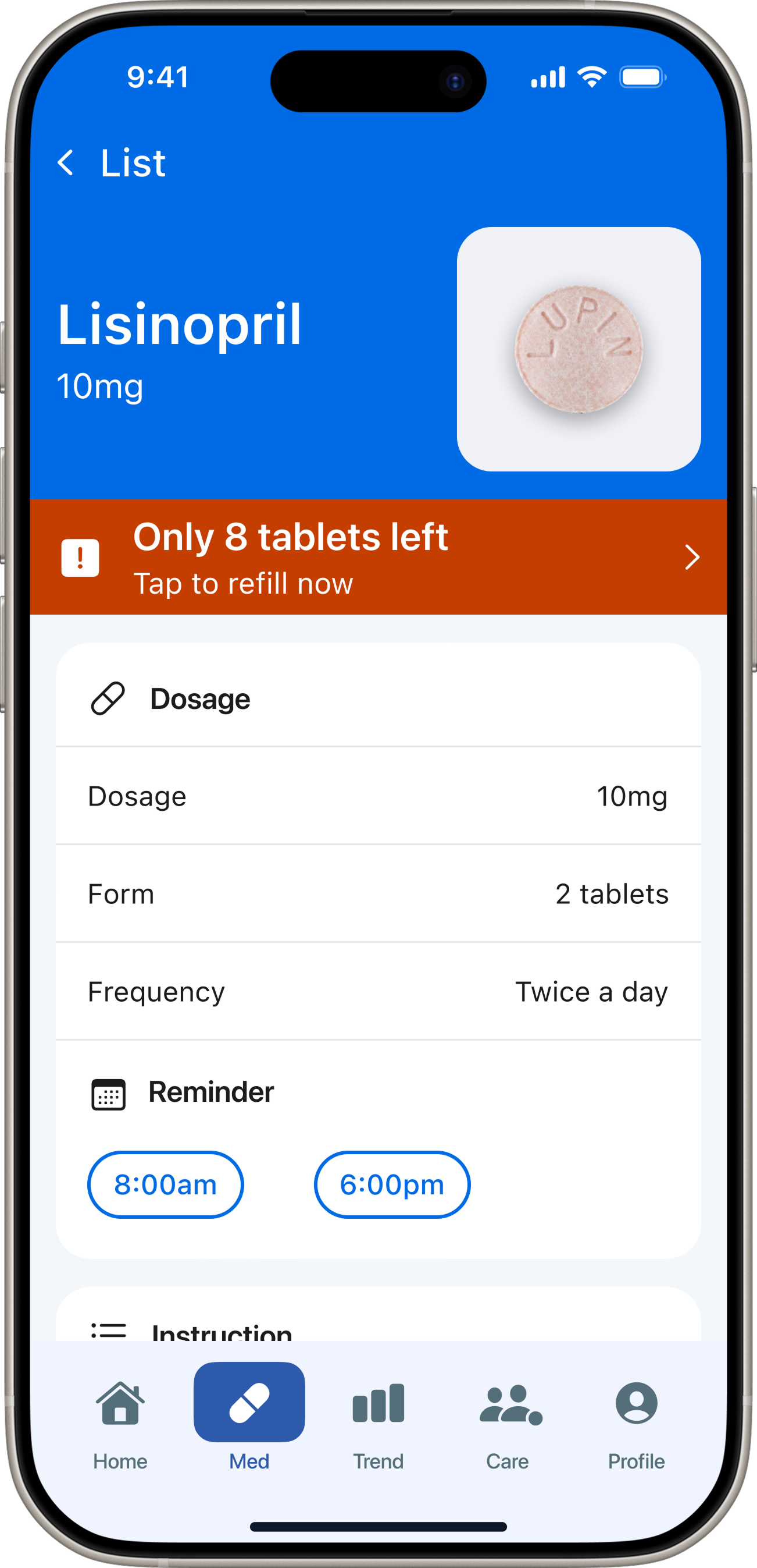
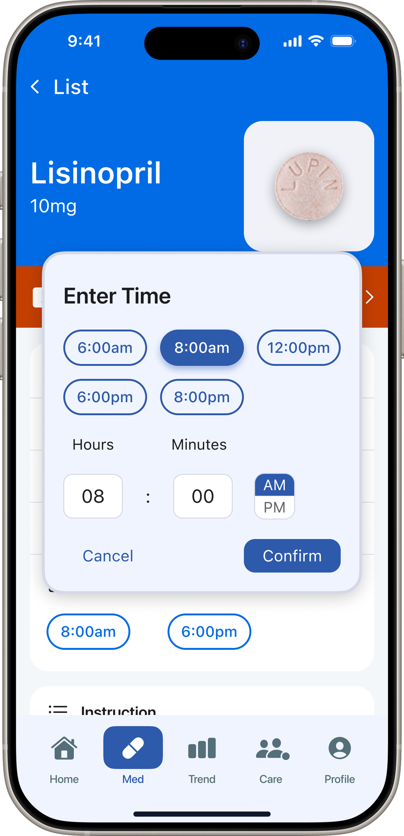
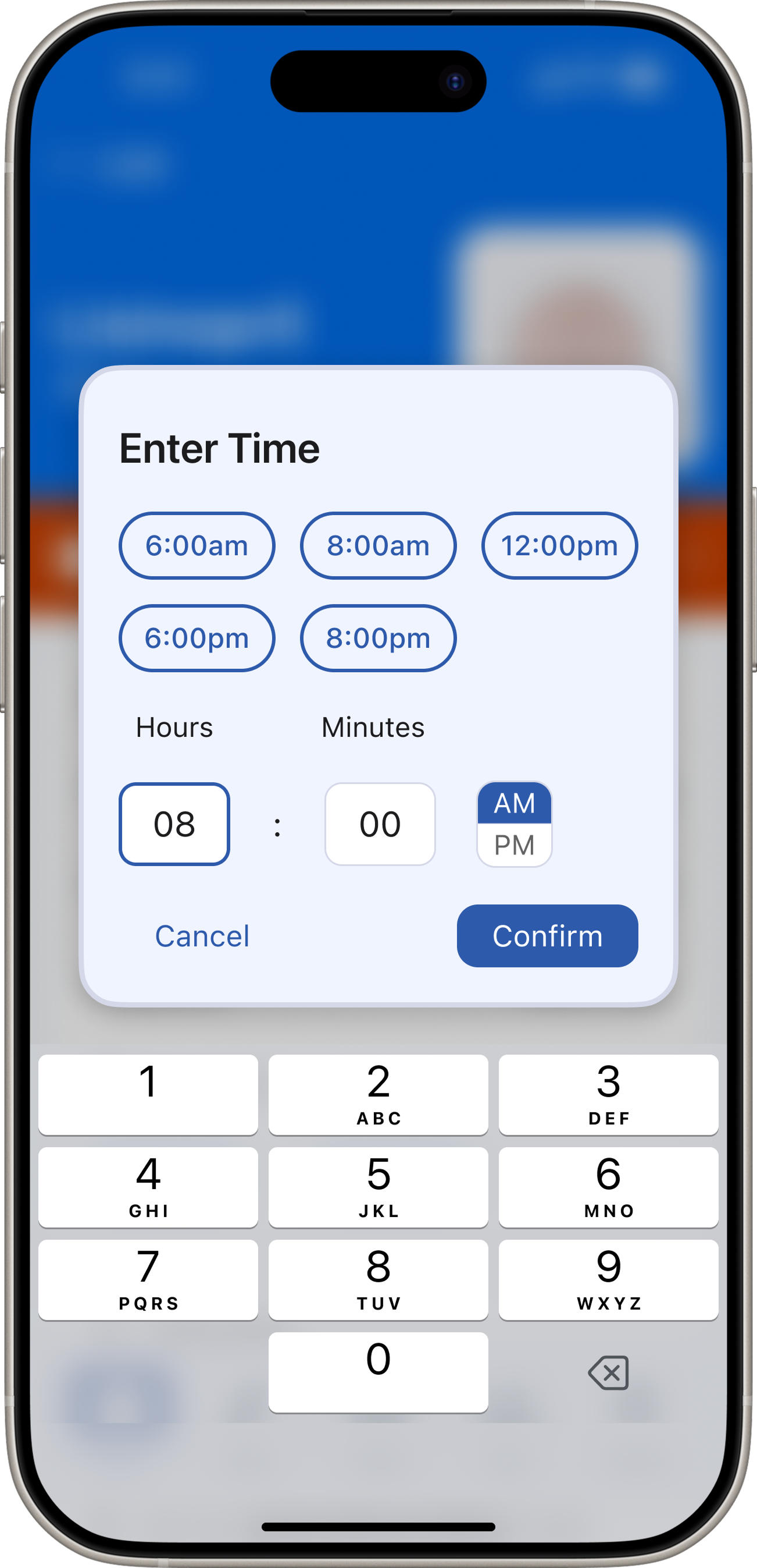
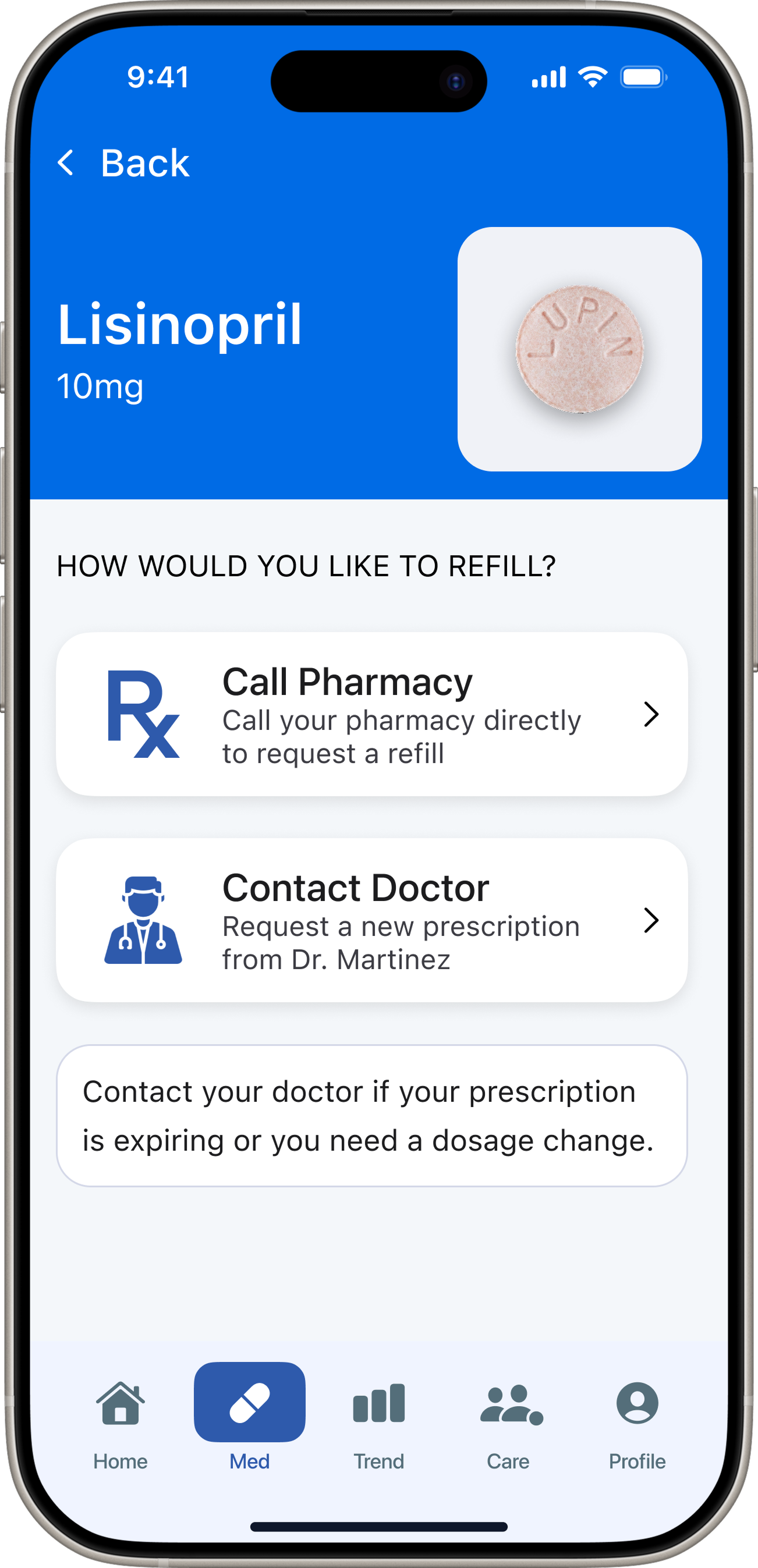
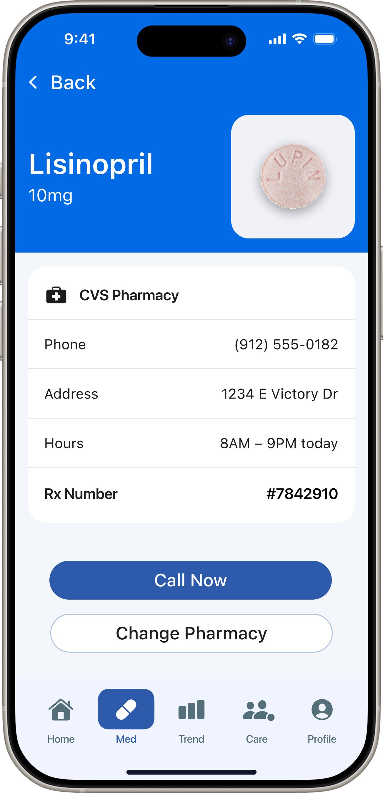
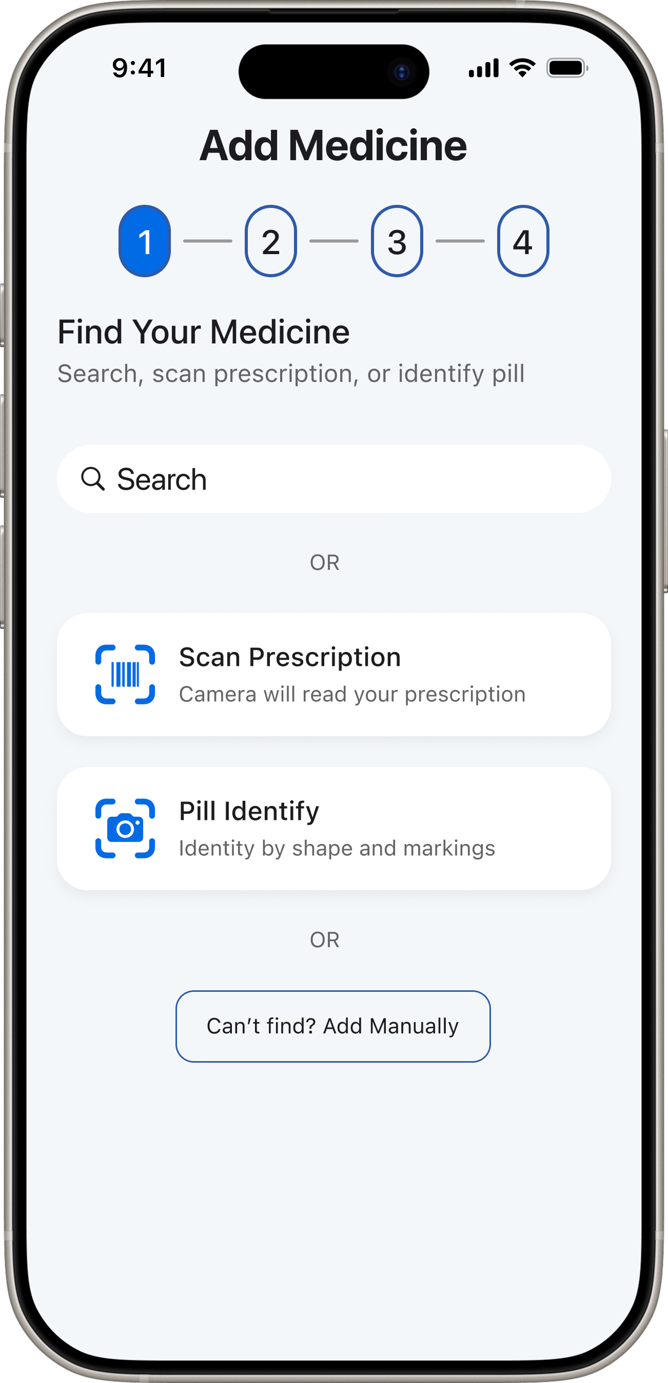
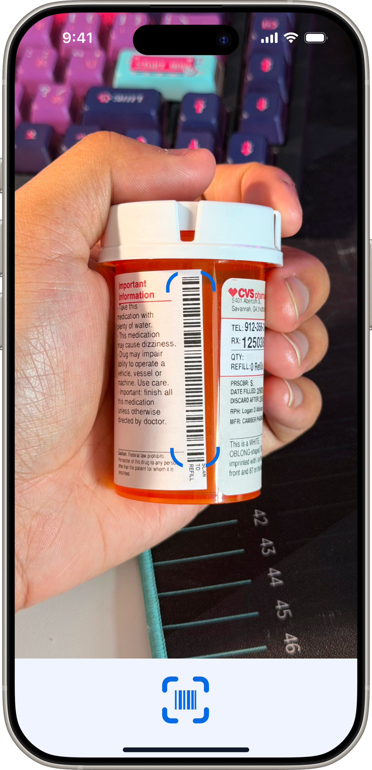
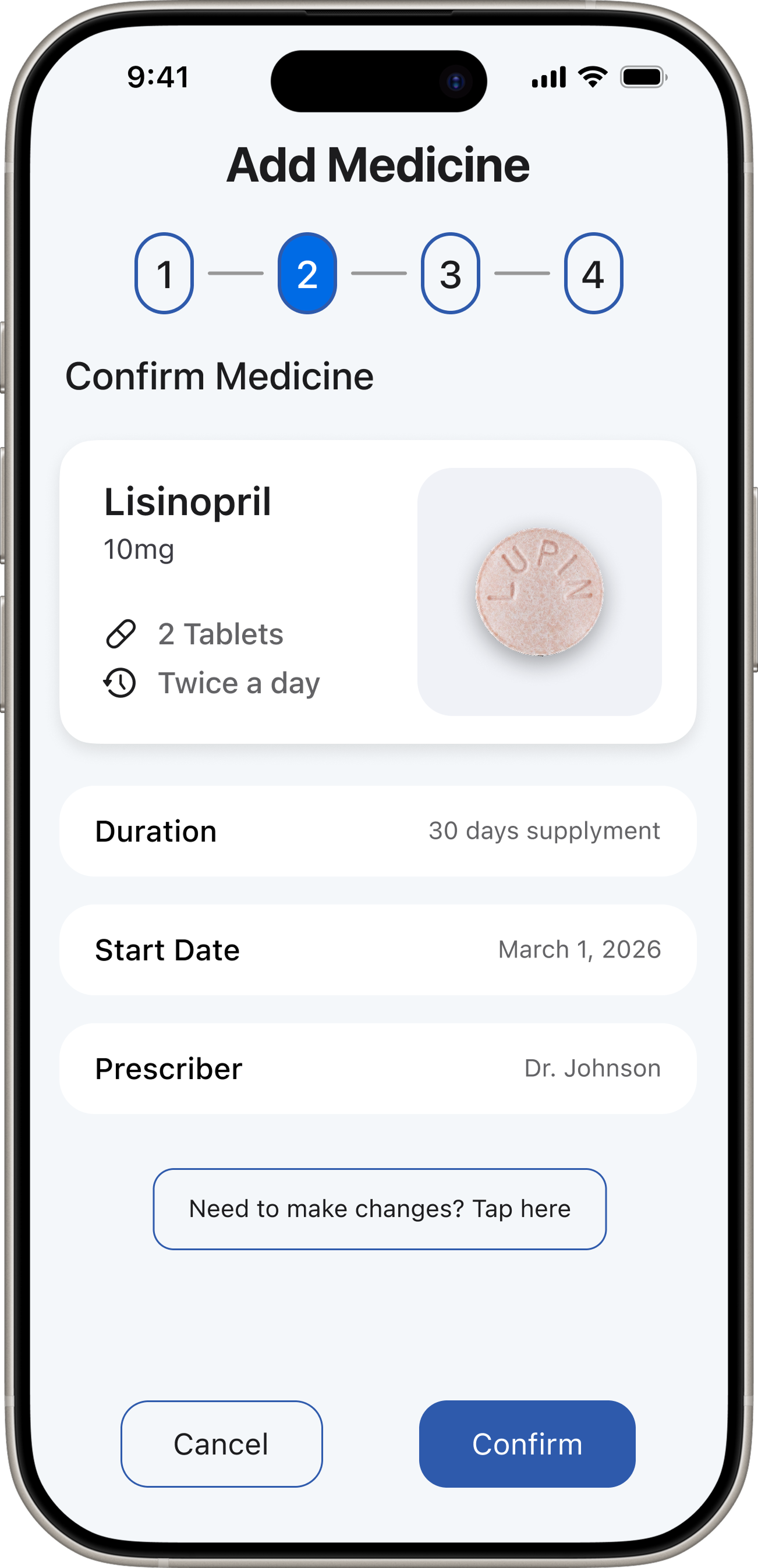
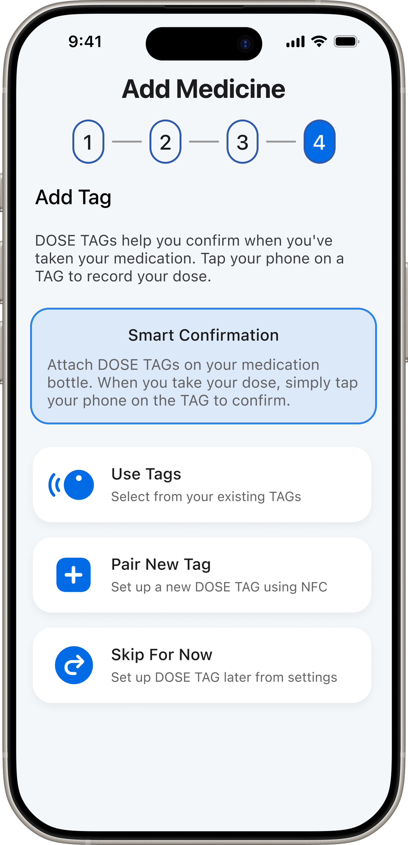
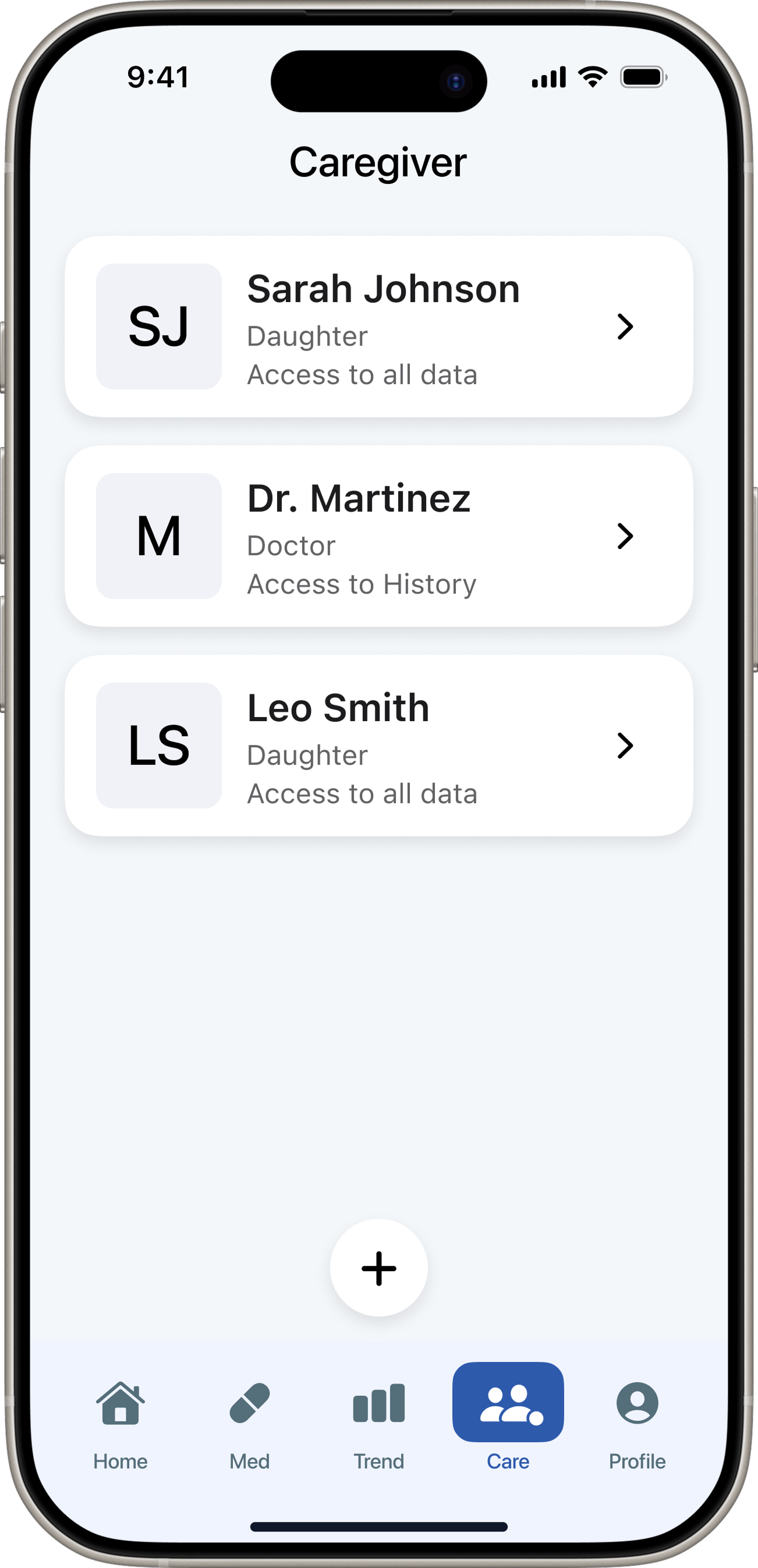
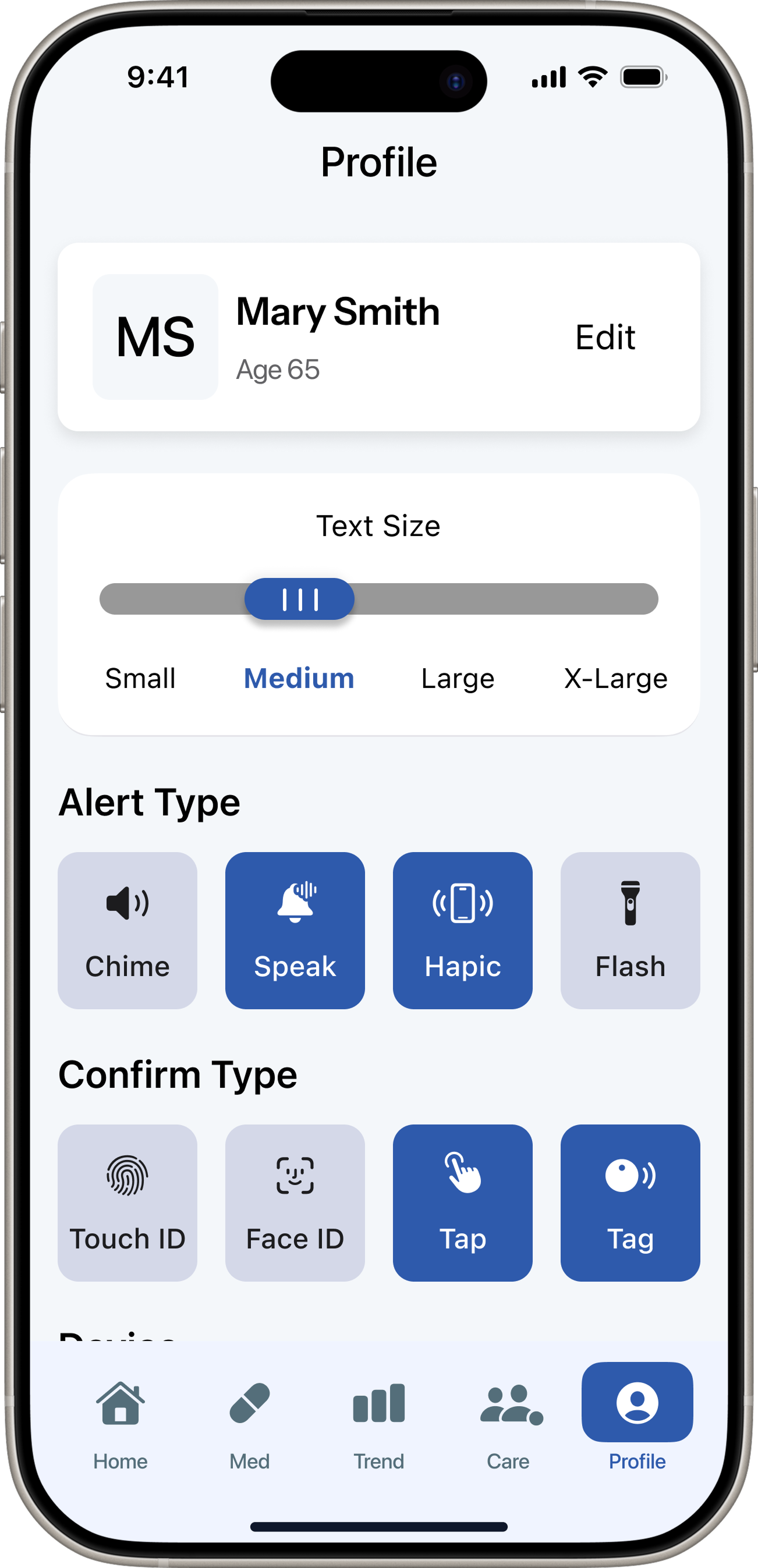
DoseCare is a medication management iOS app built around one core unmet need — confirmation. Designed from 9 user interviews and 129 research notes.
9Interviews
129Notes
5Insights
65+Target age
Role & Tools
Solo UX DesignerFigmaStarkSF SymbolsiOS